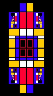
This bold graphic image is composed greatly out of squares, yet has a trendy contemporary look to it. Could it be that Less is More? Scroll down the image to go on a Square but Trendy little art trip!
NOTES: I was looking at some images of the work of artist Piet Mondrian while designing this image. This surely influenced the look of it.
BTW: I’ve noticed that people have a tendency to say that Mondrian’s work is “just a bunch of squares” in simple primary colors, and that “anyone could do it”. Nonetheless, he is regarded as a very important artist of the 20th century.
But what is art, anyway? To read a story which centers greatly around this question, click here.
Want to see more scrolling images? Visit the Scrolling Images category of this website.


Pingback: In a Modish Mondrianesque Perspective (Scrolling Image)