Pictures and words are often seen as being very different things. But pictures can inspire words, and words can inspire pictures.
The past several posts on this site have comprised what is actually a long continuous image, made up of many separate individual images. And each image has been the basis of written commentaries, inspired by the images.
Taken as a whole, these images and commentaries form a kind of “train of thought” in context. It is all part of an ongoing experiment or “journey” in this vein – and now the journey comes to an enigmatic fantasy passage…
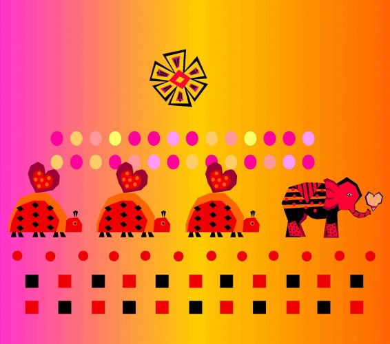
The eternal twilight of love and romance glows softly around them, as they trek endlessly across the sands of time. Where are they going? When will they reach their final destination? Only they know, as they follow the lead of their hearts.
A meeting of the hearts, a meeting of the minds
a meeting in their heart of hearts
from across the sands of time.
Together in love
together in play
like Mommy, like Baby
day after day.
And so the march continues
to places near and far
never tiring, never ceasing
but always guided by a Star.
CLICK ON IMAGE FOR LARGER VIEW.
…And so we have entered into a kind enigmatic fantasy segment of the little “journey” (or train of thought) that we’ve been on for the past several posts…
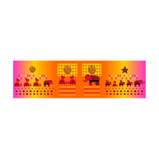
Fitting it into the “train of thought” that we’ve been riding on:
CLICK ON IMAGE FOR LARGER VIEW, AS HORIZONTALLY SCROLLING IMAGE
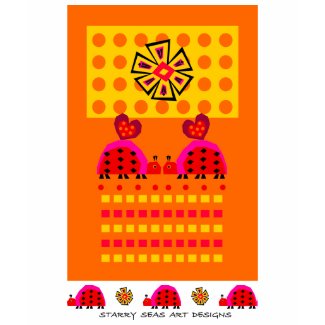
OK, now let’s see how the images in this segment look in a different context – on Clothing…
Heart Caravan
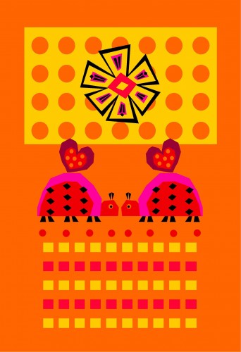
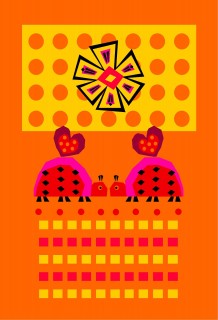
Love Bugs (with Label)
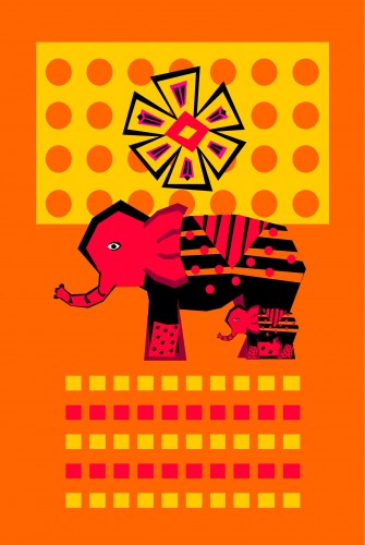
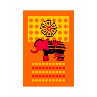
Elephant with Child
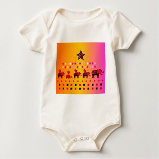
Little Caravan with Star
Little Elephants -n- Ladybugs
Risk, Risque, and Context:
In the previous post , I mentioned that when putting designs on clothing, consideration must be given to a number of different factors – including the anatomy of the person who will be wearing it. Sometimes a design might be seen as “drawing too much attention” to the person’s anatomy, when it is used in that context.
You may have heard the saying that “Less is More”. While not everyone may agree with that saying, are there instances when “taking away” from a design can actually cause it to say something “more” than the full design would say, if put into a certain context?
Let’s take this design, for instance…
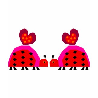
Now let’s remove the background of the design, and put the resulting design on a shirt:
How about it? Does it end up being too “risque”?
Hmmm… I’ll let you be the judge of that. But then again, as I write this, the Valentine’s Day weekend is fast approaching, and those of us who are adults know that Valentine’s Day is not only about hearts and ladybugs! So maybe in that context, Risque is Okay!
By the way, the title of the “abbreviated design” is Ladybug Lovers . Is Less really More?



Pingback: Looking Back In Time (With Horizontally Scrolling Images)