When I checked in to manage this website this morning, I saw that a reader had left this comment for a previous post, which was about an Intercontexting experiment:
“Interesante, no va a continuar con este artнculo?”
Now, I don’t speak Spanish, so I ran it through Google Translate , and it translates to something like this:
Spanish to English translation – “Interesting, is not going to continue this artнculo?”
(“artculo” translates to “article”.)
If indeed there is interest being shown in the notion of Intercontexting, then this serves to give me an opportunity (or a convenient excuse) to indulge in saying a few more things here about Intercontexting, or the “Intercontexting Principle” as I sometimes like to call it in my mind.
Stated very simply, “Intercontexting” is the combining and interweaving of different contexts together to form new contexts.
While it’s actually a lot more complex than that statement would imply, that idea would be a way to say it in a nutshell.
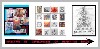
In the posts that “intercontexting” has been mentioned in thus far, I have tended to show how images are formed by combining small icons together to form larger images.
I refer to many different things when I work on artwork in this manner. I’ll name a few of them – the Periodic Table of the Elements, the grammar of language, psychology, and art style.
You may remember the Periodic Table of the Elements from some of your science classes in school. It turns out that every thing around us is made up of atoms, which are combined together to make larger entities. And the characteristics of those atoms tend to affect the characteristics of the things that are made up of them.
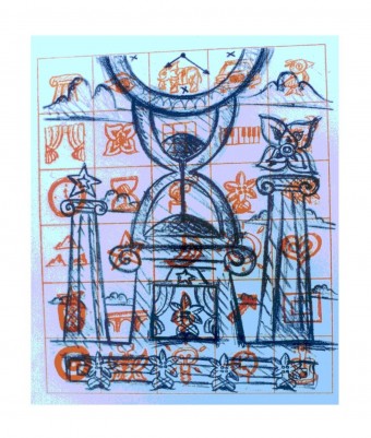
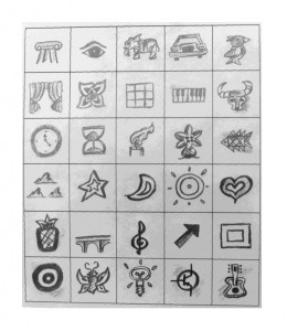
With this in mind, I sometimes like to take little icons and make tables out of them. These are like “tables of elements” that I then choose icons from to combine together to compose larger images.
As far as the grammar of language goes, I’ve noticed that visual icons can have meanings, just as written and spoken words have meanings. And just as words can be combined to form sentences and paragraphs which are meant to “say something” (communicate), so the visual icons (the “little pictures”) can be combined in context to form bigger pictures which are meant to say something in a visual way.
Psychology is used for dealing with the “ethos” of the picture – the essence of the feeling and meaning of the message that is conveyed by the picture, in context.
And the image is drawn or painted in a certain media with a certain stylistic tendency or approach – the artistic “style” that it is in.
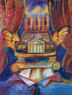
Let’s take an image from a previous post, which dealt with the status conscious tendency to “dress to impress” , and sort of analyze it with these things in mind:
It is constructed out of visual icons which include: Theatre Curtains, Car, Wings, Ionic Column, Shirt and Tie, Building, Star, and Moon:
These icons are brought together in a certain arrangement, in certain combinations with each other, and thereby form a larger picture. This is like the “grammar” of the picture.
And note that in the image, the way the icons are arranged have certain symbolic meanings. This is where the psychology tends to be involved. The shirt and tie, expensive automobile with wings, and ionic column tend to be associated with a show of high status. The theatre curtains, and the skyscrapers wearing ties and having celestial objects as heads, convey a kind of spirit of “showing off”, and of corporate arrogance. So there is a certain social and psychological meaning to the picture. And the picture is in a post that is about the tendency in human nature to try to look impressive in front of others – to “dress to impress”. So it is meant to fit into that kind of context, and is like a kind of “portrait” of this tendency of the human ego.
And as far as the “art style” is concerned, the image was painted with acrylic paints, using rather loose brushstokes and bright, bold colors. This is what might be called an “expressionistic” kind of style.
I will probably be bringing up more of the factors involved in “intercontexting” in future posts, but I think I’ve discoursed long enough about it in this post…


Pingback: Juggler’s Dream (Scrolling Image)
Pingback: Digital Butterflies and Flowers (Scrolling Image) | intercontexting.com