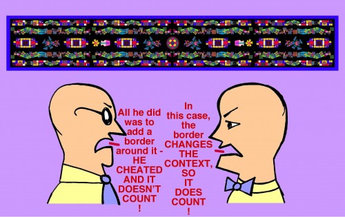
The previous post featured a long scrolling image which might be said to resemble a kind of visual music score.
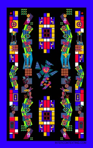
Then I thought to myself – “How would it look with a border around it?” So I took the image and placed a border around it, and looked it over. This time, I could not help but see it as being a kind of carpet-like or tapestry-like design.
Apparently, the addition of a new design element to the composition – in this case, a border – seems to place it into a different “context”.
Scroll down along the long image that follows, and let your mind go on a little “magic carpet ride” through it!
NOTES: OK, I’ll admit it – at first I felt a bit hesitant about posting this image in a separate post from the previous post, as it looks very similar to the long image in the previous post – it’s just that the border was added. However, I carefully viewed them side by side, and compared the visual and psychological impressions they made, and concluded that they did indeed convey different effects, thereby fitting into different CONTEXTS. (But of course, this is my own personal judgment…)
There are times when seemingly small additions to (or deletions from) an image can affect the way it is perceived – the feeling or meaning conveyed by the image can change. In this manner, it seems that the CONTEXT that the image is perceived in is changed.
The artist Marcel Duchamp was known for taking preexisting images and objects and making small changes to them, and then displaying them as “art”. These were known as “readymades”. It seems that the context and definition of “Art” was thereby challenged. But is it Art? And what is “Art”, anyway?
BTW: These guys have argued over other things as well. Want to see a couple of the other things that they’ve argued over? Click Here and Here.
Want to see more long scrolling images? Visit the Scrolling Images category of this website.


Pingback: I Was Born At The End Of The World